


Rush Print #002 Punctuation
An annual publication produced by the graphic design department of ArtEZ Arnhem.
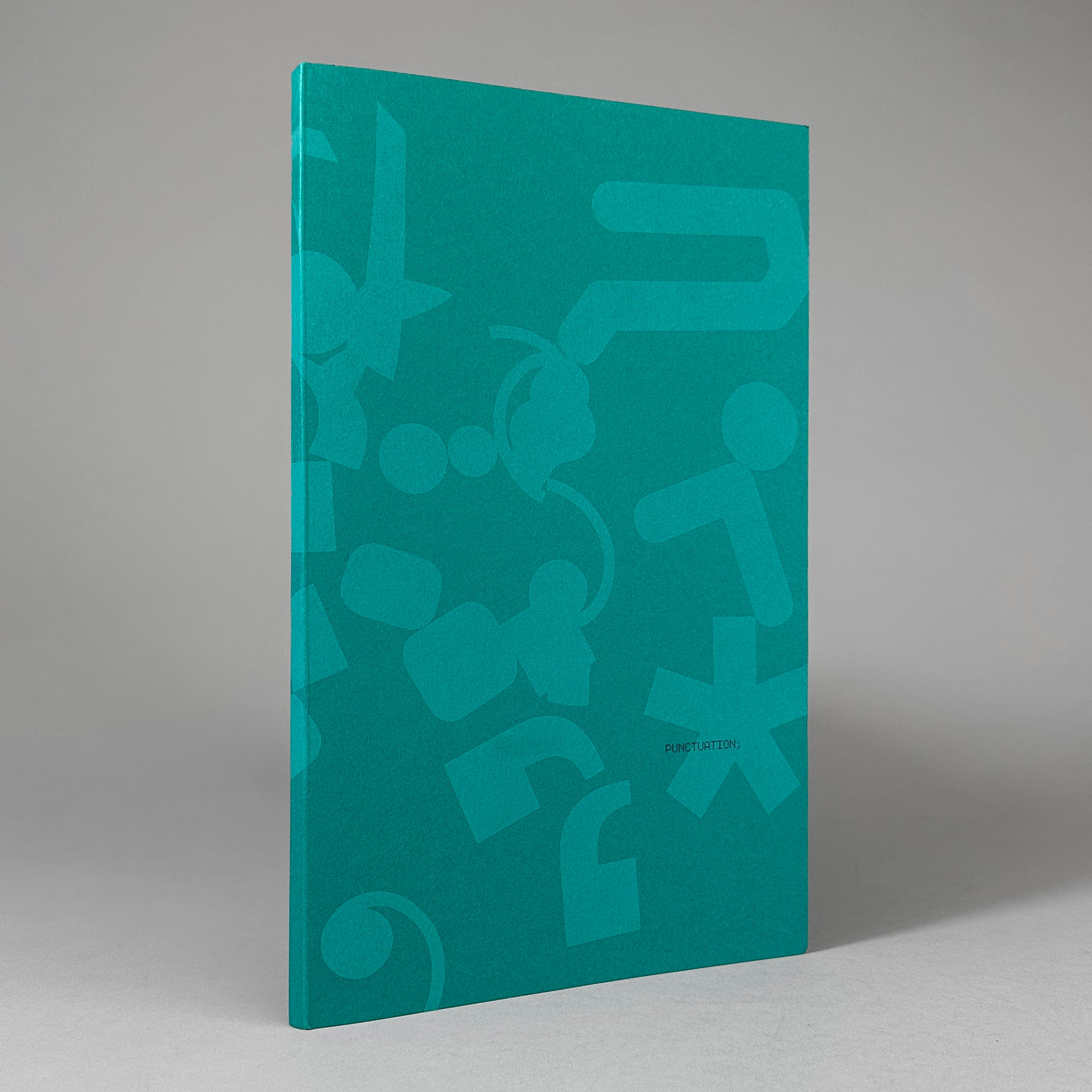
In this issue, contributors examine a specific part of typography: punctuation. Like typefaces, these typographic devices have the ability to give character to a text. Its typographic shapes are significant and essential for text-based communication, having the power to emphasize pauses, thoughts, ideas and the tone and emotion of a text. Even the smallest marks can carry the characteristics of a typeface.
Delving into the interplay between meaning and shape, the graphic design students of ArtEZ Institute of the Arts in the Netherlands sink their teeth into this fascinating topic through texts, images, and glyphs.
Contributors include Cheawon Shin, les van Bussel, Jane Lee, Jesse Gunsing, Joanne van der Wal, Marianne Born, Michelle Schipper, Polina Slavova, Sabina Scortanu, Sumin Choi, and anonymous.
Concept, design & production: Femke Kersten and Sophie van der Sman
Published by Graphic Design Arnhem, 2022
Printed in a limited edition of 170 copies
Softcover, 72 pages, 4-color Risograph, 6.75 × 11 inches
ISBN: 978-9-08-326400-4