


Revue Faire — no. 13, 14, 15
Faire is a bi-monthly publication dedicated to graphic design. Produced by Empire, the publishing arm of French design studio Syndicat (designers Sacha Léopold and François Havegeer), Faire is aimed at students as well as researchers and professional designers. Each issue addresses a specific object or theme and is written by a renowned author.
This anthology set includes three issues, numbers 13 through 15:
n°13 — A curatorial work: Graphic Design in the White Cube by Peter Bil’ak. By Lise Brosseau
In 2006, on the occasion of the 22nd Biennial of Brno, Peter Bil’ak invited twenty graphic designers and collectives to design posters for an exhibition: Graphic Design in the White Cube. These posters functioned on dual levels: as content for an exhibition (the newly created collection would be presented, accompanied by the sketches that led to the creation of the different posters) and as promotion, hung throughout the streets of the city in order to promote and provide information about the event.
Bil’ak was responding to the idea that the exhibition space isolates graphic design creations from the real world, from context (commercial, cultural, historic) and from the function that is necessary for reading and understanding them. He thus chose to make the conditions of the exhibition space (in this case the Moravian Gallery) the context for the creations and to exhibit the work of graphic designers rather than solely the objects they produce.
This strategy, which doesn’t hide its self-referential nature, was accompanied by an essay, written by Bil’ak himself — a text that continues to be regularly cited when the question of approaching the exhibition of graphic design as a subject arises. This issue analyzes Bil'ak's essay in order to question the characteristically theoretical approach of his project, attempting to place the reflexive, discursive approach and editorial undertaking of Bil’ak's curatorial proposition within the recent history of graphic design, arguing that such positions may even lead to a redefinition of the field.
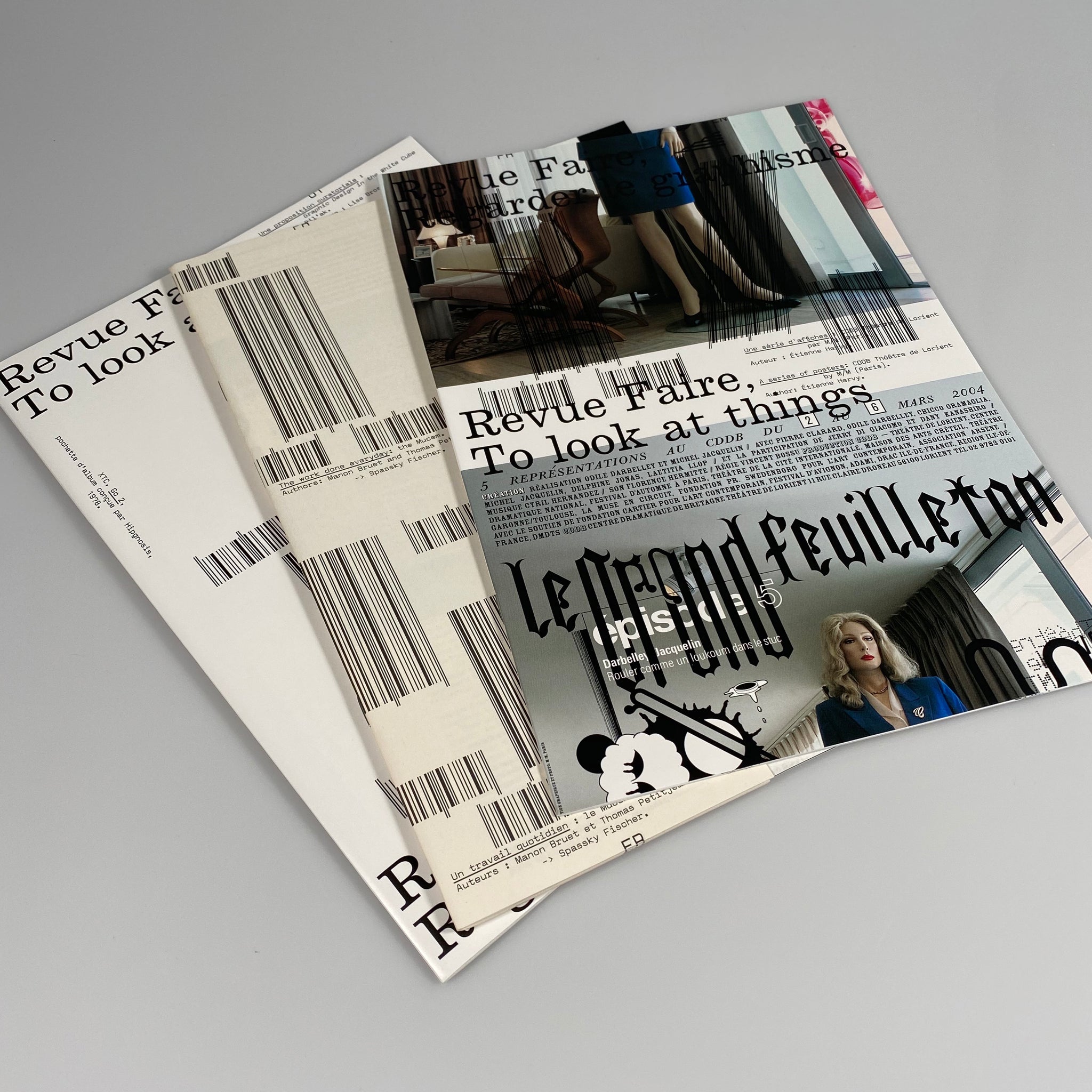
n°14 — A series of posters: CDDB Théâtre de Lorient by M/M (Paris). By Étienne Hervy
The poster, more particularly the event poster, is a building block in the identity of French graphic design. However, despite their international reputation, the work of renowned design studio M/M (Paris) for the Centre Dramatique de Bretagne (CDDB) Théâtre of Lorient has not been considered in relation to this tradition.
The posters made by M/M (Paris) for the CDDB are remarkable on more than one level: the timescale of the work, for one, along with the consistency of its principles (black and white text related to a photograph reproduced in four colors), and the power of the relationship that exists between the designers and their client, CDDB director Eric Vigner.
If that is not enough, one can also highlight the critical dimension of these posters, as much in relation to the theatre as graphic design, while also emphasizing their singularity and their innovative character, in direct rupture with the habits of the French cultural poster.
Commissioned by, and an integral part of, the CDDB project, these posters are intimately linked to the career of M/M (Paris), and they contain numerous fragments from it: voyages and busy places, steps along their route, traces of other projects, such as catalogs by Yohji Yamamoto, or collaboration with Björk who, photographed during the making of the cover for her Vespertine album, became, with photographer Inez van Lamsweerde, the protagonist of Duras’ Savannah Bay. This issue follows the trail laid by these clues.
n°15 — The work done everyday: the Mucem. By Manon Bruet and Thomas Petitjean. With responses from Spassky Fischer to Experimental Jetset, Bureau Mirko Borsche, Cornel Windlin, OK-RM, Mevis & van Deursen, Strobo, Roosje Klap, Studio Dumbar
Published by Editions Empire
Bilingual, in French and English
84 pages total, each issue separately bound, b&w and color images, 8.25 × 11.75 inches
ISBN: 979-1-09-599109-0